Conversion Rate Optimization – eCommerce Website Performance Guideline
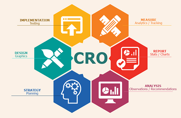

Your store needs to be designed with your customers in mind. IOGOOS Solution helping eCommerce industries to boost website and mobile app traffic that makes a purchase, also known as a conversion.
While boosting your traffic can generate more sales, it’s just as important to focus on turning your current traffic into paying customers.
At every step of your customers’ purchasing journeys, there are new opportunities for you to make their paths shorter, easier, and more enjoyable. Through rigorous experimentation and analysis, you can fine-tune your website to push people closer to making a purchase. This process is called Conversion Rate Optimization or CRO.
Conversion Rate Optimization is a technique for increasing the percentage of your website traffic that makes a purchase, also known as a conversion.
Conversions are a big deal. They’re that great moment when a casual visitor to your store finally buys one of your products.
And, on a much smaller scale, conversions are happening all the time leading up to that moment, too.
For instance, a conversion on your homepage might mean having a visitor click through to a product. A conversion on a product page might mean a customer clicking ‘Add to Cart’. Conversions can be entirely dependent on the purpose that a specific part of your website serves.
To optimize your online store for conversions, both big and small, you need to be constantly testing each and every aspect of your website.
Is conversion rate optimization for you?
CRO is a crucial tool for business owners, but it isn’t right for everyone. In order for you to successfully optimize your online store, you first need to have enough traffic to properly conduct a test.
Without the right amount of traffic, your results won’t actually provide any real insight into how your customers are using your online store. To help you determine whether CRO is right for you, let’s take a quick look at its fundamentals.
If you don’t have enough traffic to run an A/B test, focus on getting more visitors to your store instead. Here are some tactics you can use:
- The Basics of Search Engine Optimization for Your Online Store
- 6 Practical and Proven Ways to Drive Traffic to Your New Online Store
- How Blogger Outreach Can Help You Grow Your Ecommerce Store
- An Introduction to Facebook Ads for Ecommerce
An introduction to A/B testing
One of the foundational elements of CRO is a form of experimentation called A/B testing, also known as split testing.
A/B testing is a way of comparing two versions of the same webpage to see which produces better results. With A/B testing, two different versions of a page are shown to two similar sets of visitors at the same time. Eventually, the version that performs more effectively and produces a larger amount of conversions is declared the winner.
Before you conduct an A/B test, you’ll need to figure out if your website gets enough traffic to generate statistically significant results. If your sample size is too small, you won’t be able to learn anything from your results since they won’t accurately reflect how a larger population is using your site.
If you want to calculate how large of a sample size you’ll need to conduct an A/B test, you just need to drop your current conversion rate for the web page that you’d like to test into this calculator. If the traffic that the web page receives is less than the sample size required for the test, focus on driving more traffic to your website first rather than optimizing for conversions.
Finding the current conversion rate of a single page
To find your current conversion rate, you’ll first need to make sure that you have Google Analytics set up for your online store. With Google Analytics, you’ll be able to figure out the conversion rate for specific parts of your website, including the web pages that you’ll be testing.
Note: This method will just give you a glimpse of your current conversion rate and should not be used for measuring the outcome of your tests. Only use this piece of data for measuring whether or not you have enough traffic to perform a successful A/B test.
The quickest way to find the current conversion rate for specific pages of your website is by using the Landing Pages report in Google Analytics.
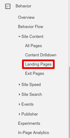
To get to Landing Pages, first go to the ‘Behavior’ section and then click ‘Site Content’. In the dropdown, click on Landing Pages. Make sure that the timeframe you’re looking at is the same amount of time that your test will be running. For the purpose of this part of the process, just use the past 30 days.
Now, select the web page that you’d like to test from the list of landing pages. For instance, if you’d like to test your home page, click on www.youronlinestorename.com.
In order to find the conversion rate for a specific goal that occurs on this page, you’ll need to add a secondary dimension to your report. Click ‘Add Secondary Dimension’ and type ‘Second Page’. The ‘Second Page’ dimension will tell us which pages visitors navigated to next and which percentage of visitors to your first page went to those pages.
For an example, let’s say that you’re interested in testing how many people navigate to the products page of your website from your homepage.
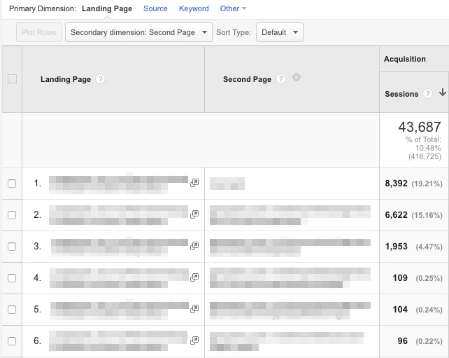
To find your current conversion rate for this action, simply choose your homepage as your initial page and then look for your products page under the ‘Second Page’ section of your report. The small grey percentage that’s listed in the ‘Sessions’ section will be your conversion rate for the action.
How to create Conversion Rate Optimization experiments
If your site has enough traffic to perform a successful A/B test, you can start experimenting on your online store.

To run an A/B test, you’ll need to use a tool like Optimizely, Convert, Adobe Target, or Google Content Experiments and set up goals for your online store using Google Analytics. Create a separate goal for every action that you’re trying to test on your website.
In Google Analytics, goals are a way of measuring how your website guides visitors to completing a specific task or objective. Goals can be anything: From a product purchase to a newsletter subscription to a simple navigation. By setting up goals for your test, you’ll be able to track and analyze the data behind the decisions that customers are making as they move through your site.
There are five different types of goals in Google Analytics: Destination, duration, pages per session, event, and smart goals. For the purpose of CRO, destination goals and event goals are the ones to focus on.
Destination Goals
These types of goals are used for tracking when a specific web page loads and track pageviews as conversion. You can use destination goals for tracking things like purchases or navigation.
If you want to track a purchase, simply set the ‘Thank You’ or order confirmation page as the destination and a conversion will be tracked every time a customer completes an order and is redirected to the ‘Thank You’ page.
To track navigation goals—like someone heading to a collection from your homepage—set the destination as your collection page.
Event Goals
Event goals can be used to track actions on your website that do not necessarily lead someone to a landing page.
For instance, if you want to track someone subscribing to your newsletter or adding an item to their cart, you can set the action of a customer clicking a specific button on your website as an event.
20 CRO Experiments to get you started
Optimizing your online store isn’t a one-and-done solution for ecommerce, it’s an ongoing process that will help you constantly learn more about your audience and how you can better serve them. It’s not a tactic with an endpoint—it’s something that you should always be doing to get better.
There’s no set rulebook for optimizing your website either. Tactics that work incredibly well for one store might have no effect on another. That’s why it’s important for you to start experimenting now, so that you can track your results and figure out how they can help you build a more successful store.
Be sure to keep a list handy of all the experiments that you’re planning on running in the future, so that you’re never without a new idea to explore.
To get your list started, here are some suggestions for different things you can potentially test throughout your online store.
Table of Contents
- Homepage
- Product Discovery
- Use Intelligent Search
- Organize Your Categories Effectively
- Take Advantage of Your 404 Pages
- Add a Shoppable Instagram Feed
- Product Pages
- Use High Quality Product Images
- Be Upfront About Price, Delivery Time, and Out of Stock Products
- Showcase Your Product Reviews
- Add a Curated Instagram Feed
- Checkout Experience
- Shipping and Returns
- Additional Information
- Website Speed and Performance
Homepage
Think about your homepage as a physical storefront. It’s the front window of your store: Capturing attention, igniting curiosity, and pulling people in.
Your home page needs to feel inviting and make it easy for people to enter and navigate your store. It needs to be a visually appealing and consistent experience that works towards achieving a single goal: Get people further into your store so that they can find products they want to purchase.
1. Simplify the experience
When it comes to designing an effective homepage, simplicity is key. It only takes two-tenths of a second for a customer to form a first impression of your website, so you need to do everything possible to make those moments count. Avoid overwhelming your customers with excessive images and text. Instead stay on-brand and on-message with a simple, visual appealing design.

Just take a look at Province of Canada. For their homepage, they’ve used a large hero image that occupies most of the space above the fold. The copy is simple and straight to the point with a clear call-to-action that pushes visitors right to a collection.
If you’re not sure what to feature as your main hero, it’s usually best to go with either your best selling or most profitable products, or collections like new arrivals or current promotions. This is especially true since 86% of website visitors want to see information about products on the homepage of a website.
2. Show off coupon codes, real time purchases, and more
As soon as your customers hit your homepage, you have the opportunity to start building excitement and driving them towards your products. If your goal is to get more traffic to your products, there are a bunch of great apps for Shopify store owners that can help drum up demand and incentivize purchasing:
- Welcome Bars: Apps like Welcome Header Bar and Quick Announcement Bar let you share sales, coupon codes, promotions and more with your customers as soon as they arrive on your site. These apps add a non-intrusive floating bar to the top of your homepage that will instantly grab your customers’ attention and push them exactly to where you need them to be. Promo codes can be powerful tools: Build.com was able to increase conversions by 6% for their affiliate traffic with a custom promo code.
- Popups: Popups and popunders are fantastic for building your email list. Try using an app like Privy or POWr Popup to add a quick popup to your home page offering a coupon code in exchange for a newsletter signup. Email marketing is incredibly effective: According to a 2014 study, 80% of consumers who signed up for emails from a brand over a six month period ended up making purchases based on what they’ve received.
- Real Time Purchases: Apps like Yo, Recent Sales Notification, and Notify add a small notification to the bottom corner of your store, showcasing real time purchases being made by other customers. These apps incite a sense of urgency while also giving customers social proof that other people are out there buying your products right this minute. Behavioural psychology researchers at the University of Kentucky report that urgent situations cause people to act impulsively and quickly.
For example, take a look at Atelier New Regime. They’ve used the Free Shipping Bar app to show off their free shipping threshold right on their homepage.
After a few seconds, visitors to their online store also get served this gorgeous popunder encouraging them to join the Atelier New Regime mailing list for access to news and exclusive deals.
3. Add Testimonials to Build Trust
Have you been featured on major publications? Are your products used by any high-profile influencers? Add testimonials, reviews, and badges to your homepage beneath your main content to build trust and project credibility. After all, 88% of consumers trust online reviews as much as they trust recommendations from their friends and families.
If you want to create more opportunities to get testimonials for your products, take a look at our guide to hacking the press or try reaching out to bloggers directly for features.
Product discovery
Once customers are on your homepage, they need to be able to find the products that they’re looking for and discover new products that they might be interested in.
Your customers need to be able to navigate your website through a well-thought-out search function, smart category design, and engaging ways to discover products.

4. Use intelligent search
If your customers are looking for a product on your website, the chances are that they might not know exactly where to find it.
During its own CRO analyses, UK apparel retailer Topshop noticed that customers were having difficulty finding and using its internal search box—and that customers who managed to use the search box typically converted 10x higher than others. With extensive testing, Topshop was able to improve its search box design, leading to a 5.8% increase in conversions.
If your store has a large amount of products, you might want to considering featuring your search bar prominently on your homepage, giving your customers the opportunity to head directly where they want to be rather than digging through categories.
With apps like Findify and Instant Search +, you can power up your search bar with predictive results that help your customers find what they’re looking for. Intelligent search bars suggest results and products as users are typing while taking into account things like spelling errors and alternate product names.

Sigler Music uses the Instant Search + app to help their customers find exactly what they’re looking for. Even after entering just a few letters, the search bar already starts suggesting categories, products, and related results.
5. Organize your categories effectively
For your customers, navigating your website should be easy, simple, and—most of all—obvious. Try to avoid separating your products into too many different categories. Instead, opt for 4 to 6 broad categories that contain more specific subcategories as a dropdown.
Order your categories in your navigation bar based on their popularity, with your most popular category at the front.
6. Take advantage of your 404 pages
Are your 404 pages a dead end? Instead of leaving customers hanging when they hit a 404, try to guide them to other parts of their website that might be more useful. Customize your 404 page to feature links to your most popular collections, products, and promotions.
If you need help editing your 404 page, take a look at this video walkthrough or get in touch with a Shopify Expert.
7. Add a shoppable instagram feed
Instagram is an extremely useful tool for product discovery. Embedding a shoppable Instagram feed onto your website is a great opportunity to inspire your fans with gorgeous photos and show off your products in everyday scenarios.
Shoppable Instagram feeds are perfect for display user generated content which is starting to play a massive role in the purchasing behaviours of Millennials. Research indicates that 84% of Millennials report that user generated content on websites has an influence on what they purchase.
If you own a Shopify store, you can embed your Instagram feed onto your online store using apps like Foursixty, Like2Have.it, Springbot, SocialPhotos, and Showcase, just like the one above created by MVMT. With these embeddable Instagram feeds, you can promote your top products and link out directly to their product pages, giving your fans a visually engaging way to find new products.
Product pages
Each and every one of your product pages needs to built around clearly communicating the value of your products to your customers. You need to build immersive experiences that cover every aspect of your products while removing any opportunity for doubt or frustration.
8. Use high-quality product images
High quality product photos are the most important part of an effective product page. More than ⅔ of consumers say that high quality product photos are a very important part of the purchasing process—more important, in fact, than product details or reviews. Try to include images that show your products from every angle and accurately represent the look and feel of your products.
As a bonus, include a video that shows your product in action. For instance, if you’re selling t-shirts, add a video to your product page with a model walking around while wearing one of your t-shirts to give customers a better idea of what your shirts look like in motion. Customers are actually 85% more likely to make a purchase after watching a product video.

Bando has some great examples of well-executed product pages. Check out this page for a 17-month agenda, featuring a bunch of high quality photos and a fun, quirky video that really lets the product shine.
9. Be upfront about price, delivery time, and out of stock products
The worst thing that you can do is mislead your customers—28% of customers will abandon their cart if they get charged with unexpected shipping costs. Don’t be afraid to let them know the full extent of things like pricing, delivery time, and inventory. If you do an effective job of selling your products and communicating their value, your customers won’t mind paying a little extra for shipping or waiting a little longer for delivery.
If you own a Shopify store, you can also use apps like Restocked Alerts to give your customers the option to be notified when out of stock products are added to your store.
10. Showcase your product reviews
Product reviews are a great way to ease the doubts of hesitant shoppers and give your customers the social proof that they need to click “Add to Cart”. In fact, 90% of customers say that their purchasing decisions are influenced, in one way or another, by reading online product reviews.
Positive product reviews can make all the difference in convincing shoppers that a product really works and is actually worth purchasing, along with helping them make more informed decisions in regards to sizing, colour, and more.
Shopify store owners can use apps like Product Reviews and Yotpo to embed customer reviews directly onto their product pages.
Product reviews can be especially helpful for business in the beauty and skincare industry. Beardbrand, for instance, uses Yotpo to showcase reviews on every one of their product pages.
11. Add a curated instagram feed
Just like product reviews, curated Instagram feeds can also add an element of social proof to your product pages. When looking for information about a product, 51% of US consumers actually trust user generated content like Instagram photos over anything else.
Product page Instagram feeds are specially useful for beauty and apparel companies since they can show your customers how to style your products and give them a better idea of how they look and feel in real life.
To embed Instagram feeds on your product pages, try apps like Foursixty and Like2Have.it.
Checkout experience
The checkout experience is one the final steps of every customer’s purchasing process, so it needs to be as frictionless and flawless as possible to avoid having frustrated customers abandon their carts at the last moment.
At this point in their journey, your customers are display clear intent to make a purchase. You need to make that purchase happen quickly and conveniently without any stress or confusion.
12. Pre-fill your customer’s information
You can make it even easier for your current customers to make repeat purchases by prefilling their shipping and billing information with customer accounts. The less information customers need to enter, the better. One study from last year even reports that conversions increase 200% when businesses allow customers to autofill information on social media.
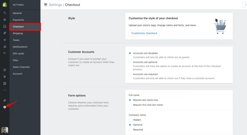
In your Shopify admin, head to ‘Settings’ and then ‘Checkout’.
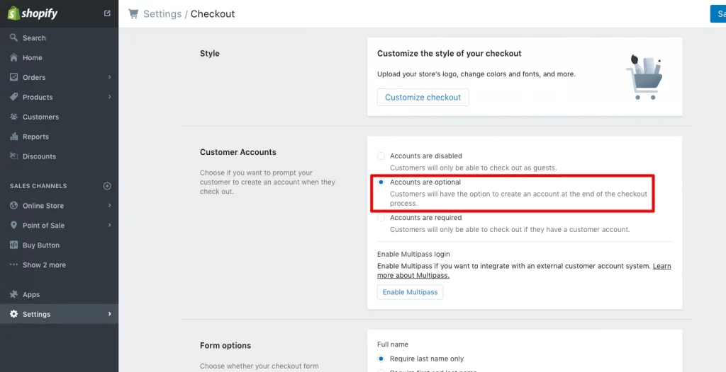
Under ‘Customer Accounts’, select ‘Accounts are optional’. With optional accounts, your customers will still be able to checkout as guests, but it also gives them the chance to save their information for next time after filling out their personal details.
If you want to invite your current customers to make accounts, you can use the Bulk Account Invite Sender app.
13. Send abandoned cart emails
Unfortunately, customers sometimes fill up their carts with products and then leave your store with no intention of returning. With abandoned cart emails, you can remind those customers of the items that they’ve already expressed interest in and give them a little nudge to return to your store to complete the purchase.
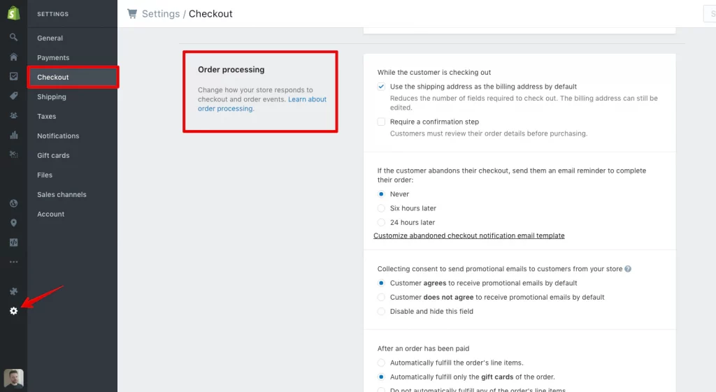
Abandoned cart emails can be set up in the ‘Settings’ section of your Shopify admin. Go to ‘Checkout’ and then scroll down to the ‘Order Processing’ section. You can choose to send abandoned cart emails either 6 or 24 hours after a customer abandons a cart.
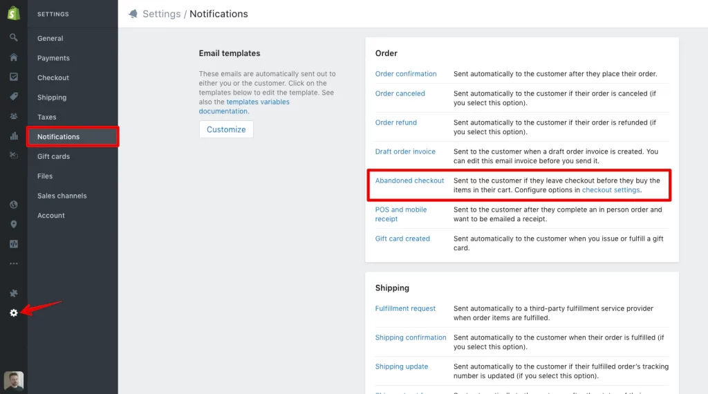
You can customize your abandoned cart emails in your Shopify admin as well, so that they fit your brand’s image and tone. Go to ‘Settings’ and then ‘Notifications’. Under the ‘Template’ column, you’ll see one for ‘Abandoned checkout’.
14. Optimize your thank you/order confirmation emails
In the same ‘Notifications’ section of your Shopify admin, you can also customize your Order Confirmation emails.
After a customer has placed an order, there’s still an opportunity to put them back into your purchasing funnel by optimizing your Order Confirmation email to encourage them to sign up for your newsletter, link them to content on your blog, or offer them exclusive discounts and promotions for future orders as a token of appreciation.
Shipping and returns
Even after a customer has gone through the checkout process, you need to remember that the purchase isn’t over until the product is in their hands. Think of how you handle shipping and returns as yet another opportunity to delight your customers and turn all of those one-time shoppers into lifelong customers.
Waiting for a package is an anxiety-inducing experience. Receiving a product that you’re dissatisfied with is even worse. You need to do everything in your power to make shipping and returns enjoyable for your audience.
15. Offer free shipping
Expensive shipping costs can be a huge pain point for customers and potentially hold them back from making purchases. Try offering free shipping to encourage your customers to put in an order, regardless of how far it has to travel. Free shipping can have a major impact on conversions: In one case study by SitePoint, offering free shipping increased conversions by 50%.
16. Have a clear refund policy
It’s no surprise that some customers are hesitant about making purchases online. When it comes to ordering things like clothing, it can be difficult to know exactly how a piece will fit in-person. To help relieve your customer’s concerns, make sure that your business has a clear refund policy so that they know exactly what they can do if they aren’t satisfied with an order.
Use Shopify’s Refund Policy Generator to create a refund policy for your store.
Additional information
Although optimizing elements like your homepage, product discovery features, and product pages is crucial for pushing your customers through the conversion funnel, you also need to make sure that your website contains additional information like contact details and an about section.
17. Tell a story with your about page
Your About Page is so much more than a brief summary of your store. It should tell a story to your customers about your products and your brand’s mission. The goal of your About Page should be to build a lifestyle around your products that your audience will want to be a part of.
Try to build a story around both your products and your customers’ relationship with them. Ask yourself questions like: Where did your idea come from? What makes them special? What does an average day in your ideal customer’s life look like?
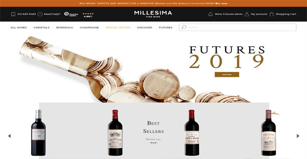
Endy has a comprehensive About page that sells their mattresses from a number of different angles. At the top, you’ll find a great hero image, a concise summary of their products and what sets them apart, and a link to some customer reviews.
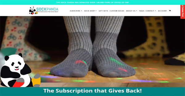
As you scroll down, you’ll see details about their shipping and return policy as well as a charming story about the origin of their name.
18. Create a comprehensive contact page
If your customers want to get in touch with you, they should be able to do so easily. In fact, 44% of visitors will leave a website if there isn’t contact information or a phone number available.
For customers, not being able to share their thoughts and feelings—whether positive or negative—is an extremely frustrating experience. Your contact page should include ways for your customers to reach out when something goes wrong as well as opportunities for them to engage with your brand in fun and exciting ways.
Here’s a quick checklist of everything that your contact page should include:
- An email address or contact form
- Your physical location, along with a map and directions
- Your retail store hours
- Links to your social media profiles
- Support-specific contact options, including a phone number or email
Website speed and performance
The performance of your website is closely tied to your success as a business. In fact, if a website takes longer than 3 seconds to load, 40% of visitors will automatically leave. That’s a huge amount of traffic that you could be turning away without even realizing.
Imagine you were waiting outside a store and you had to wait for the owner to come to the door to let you in. Sure, you might wait one or two seconds for them to come to the door. But fifteen? Thirty? Try counting those seconds out loud and you’ll soon realize what you could be putting your customers through.
19. Make sure your site is mobile responsive
Being mobile responsive should be a massive priority for your business. In fact, 40% of people will choose another result if the one that they land on is not mobile-friendly. Thankfully, if you own a Shopify store, every Shopify theme is automatically optimized to be displayed properly on every device.
If you want to check if your website is responsive, just drop your URL into Google’s Mobile-Friendly Test tool.
20. Optimize your website’s loading times
The easiest way to check how long your online store takes to load is by using Google’s Pagespeed Insights tool. Pagespeed Insights will give you a detailed report of how fast your website loads, along with any issues that you can resolve to improve your load times. Alternatively, you can also use load time evaluation tools like WebPageTest and Pingdom.
While optimizing your store’s load times can be a complicated process, there are a couple things to always keep in mind. The size of your images can have a significant impact on how quickly your website loads. Try to compress and optimize every image using a tool like ImageOptim. ImageOptim strips away all of the unnecessary data in every image file, resulting in a much smaller file size with no noticeable visual difference.
Additionally, for Shopify store owners, try uninstalling any apps that you’re no longer using as these apps can still put an additional load on your website even if they’re disabled.
Start your first experiment
Now that you have some ideas, it’s time to start optimizing! Get out there, run experiments, and discover exciting new ways to increase your conversions.
Remember: Always be testing.
Have any more questions about Conversion Rate Optimization? Let us know in the comments below.

Get In Touch
Our consultants will respond back within 8 business hours or less.
 +1-315-215-0919
 +91-9136-747327
Leave a Reply